I started "modernizing" the look of this blog last weekend. It's a mess^H^H^H^Hwork-in-progress. Asked for inspiration on twitter (thanks!) and started... hmm...well, stealing from:
- http://www.strangenative.com/category/ideas/
- http://jasonsantamaria.com/
- http://www.nitinh.com/
- http://www.integralist.co.uk/
I like stuff minimal. And this is a blog, so it's meant to be read. The only thing I can do to improve the life of the three people reading it is to make the content readable. This will also probably help the content appear more trustworthy. I know sometimes crappy design can cause the content to be perceived as lower quality.
So design... and typography. Two areas where I don't know what I'm doing. I spent Saturday night assembling my Frankenstein of a design from these sites above. (I know good designers keep a list of stuff they stumble upon and like in preparation for the times when inspiration is needed. I, of course, don't do any such thing)
Mobile Safari Reader
Testing the little monster on iPhone I thought about checking it out in the Mobile Safari's Reader. Wha - not too far off! Except for the huge H1. I decided to look at how Reader renders more closely and see what I can learn from it.. After all Apple are known for their design work. They must be the Masters!
Reader? What Reader?
Safari has a feature probably most technical folks ignore and mistake it for an RSS reader of some sorts. But it's actually a better rendering of a chunk of text. Seems like when Safari figures out there's a big piece of text they present this Reader button because they feel they can show a more readable version than some web sites (and we've all seen our fair share of hard-to-read pages and inconsiderate color schemes).

Click it, and you get a more readable version of the text.

How about that!
Inspecting
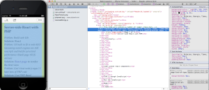
The best part is that the remote debugging feature in newer Safari lets you inspect the Reader-rendered content. As in, in Web Inspector you see the CSS, line-heights and all. For a person like me who can't tell Helvetica Neue from Helvetica Olde, deconstructing typography from an image is next to impossible. But with plain text CSS on the other hand...
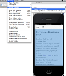
- Open your page in iOS simulator (connecting a device with a cable works too if you don't have a simulator)
- Click Reader
- Open desktop Safari, select Develop menu (if you don't have the menu, go to Safari's Preferences, then Advanced, then "Show Develop menu in menu bar". If there's no such option, upgrade Safari)
- In the Develop menu find your device and inspect
Reader~iphone.htmlpage
Boom!
The page is yours to inspect.
There in plain text CSS you can learn and steal all the fonts and sizes and padding you want.
In conclusion
Three things.
The Reader is done in HTML. A native feature of a native app (browser). Take that nativists! 😛
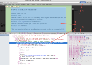
This feature is also available on the desktop:
Lastly: beats me why do we use Serif fonts on the Web/Mobile. I've seen "best practices" suggesting that Serif is more readable on paper, while sans-serif is better on screen. For whatever definition of "readable" (easier? faster? retaining more?). But whoami to judge, I'm merely a humble apprentice 🙂
Comments? Find me on BlueSky, Mastodon, LinkedIn, Threads, Twitter
